This weekend was peak leaf color in our little Massachusetts town. Wherever you live I hope you had a good one.
The technicolor foliage got me thinking on red and green. It is one thing in the garden. Indoors, a lot of red and green can make a room sing Jingle Bells. And if that's what you love, do it. Life is too short to be timid.
 |
| The Home Alone house via Hooked on Houses. This movie made my mother-in-law laugh out loud, and she's a serious woman. |
Predominantly red with some green is not the easiest combo to pull off. Stephane Boudin designed two rooms in the 1950s, and they are still in use today in Northern Italy.
 |
| Stephane Boudin on AD. Bedroom and sitting room swathed in Tree Poppy from Colefax and Fowler. The current resurgence of chintz makes this a fine candidate for inspiration. |
This look, using a bold pattern on just about everything, is not in vogue today. So it may seem way too much for younger readers. Or even a little grandmotherly.
It is Colefax and Fowler's Tree Poppy, as beloved as English prints get. It has been in constant production since the late 1940s, it is iconic John Fowler.
Small digression: I do some gardening and I know what Tree Peonies are, but Tree Poppies? My first thought was a fanciful title. Wrong again, that makes twice in less than a week. Leslie, the charming author of the blog Hostess of the Humble Bungalow, has Tree Poppies her lovely garden. Here's a link to one of her garden posts with plenty of envy-inducing floral eye candy including Romneya Coulteri or as the Brits know it, Tree Poppy: Hostess of the Humble Bungalow.
 |
| A "television room" in Italy. Stephane Boudin on AD. I love botanicals. |
Babe Paley in 1950. Her room isn't predominantly red either. No argument that red is the star.
 |
| 1950. Babe Paley in her George Stacey designed room and Charles James designed ball gown. |
Some contemporary examples.
 |
| Carlos Souza, Brazil, on AD |
 |
| Nancy Serafini Interior Design. Love that Regency chair. |
 |
| Richard Keith Langham via AD. |
 |
| Beverly Field via Veranda. |
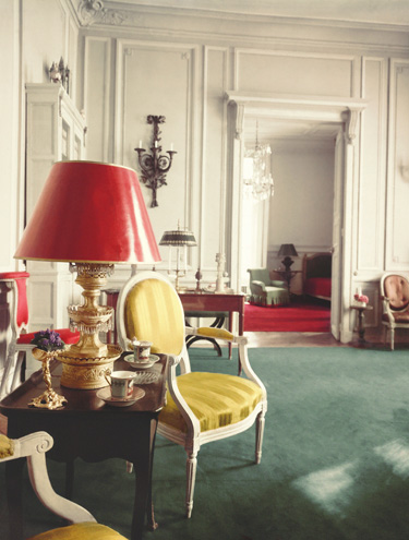
After doing this research I find the rooms where green dominates very appealing. Lets the red be the drama queen.
 |
| A George Stacey flat featured on the cover of George Stacey and the Creation of American Chic by Maureen Footer. I own this excellent book. Legions of designers working today have been influenced, knowingly or not, by George Stacey's work. |
 |
| Jewel box! Egad, I love this room! Nick Olsen designed this beautiful Brooklyn brownstone. Read the whole article with all the pics, August 2015, Architectural Digest. |
 |
| Summer Thornton Design. Heralding the return of black chintz? |
 |
| The Greenbriar's Cottage Dining Room. Dorothy Draper and Co. |
 |
| In the Green Room, 2010. Every man's closet should have at least one blue suit. |
 |
| Bits of red. My foyer's chair in Schumacher's Chiang Mai Dragon, the Jade colorway. |
Could you live in red and green room? Or a green with a splash of red?
This post was entirely unsponsored.
Thanks for reading,
Linda Pakravan
 |
| BBC - Gardening. |


Linda... Great photos. I have always had a healthy dose of red in my house and I positively love red and green together. Have a wonderful week.
ReplyDeleteI'm definitely not a red person, though I do love the Tree Poppy print. I'd probably be more inclined to use it with pink and pale green to soften it.
ReplyDeleteI do like the Greenbriar cottage dining room - lots of fun looks in there. The red and green are wow! I especially like the bird sconces!
ReplyDeleteLinda, great photos to accompany this post. I have lots of red in my old house but more blue than green seems to be the other color. Not Jingle Bells but Old Glory! Hope you are doing well.
ReplyDeleteBarbara, I've missed you!
DeleteLinda, I love how a designer can make a green and red room look so appealing, I love the deeper reds, almost merlot. The images you chose are perfect, do you have the Gorge Stacey book, it is wonderful!
ReplyDeletexoxo
Karena
The Arts by Karena
Halloween Artistry
Yes, I do have the book. I'm on my second reading!
DeleteThis is a sumptuous post...I love these bright interiors, they are so lush and beautiful.
ReplyDeleteThank you for the mention Linda, I am honoured!
"lush and beautiful" the perfect description!
DeleteLinda,
ReplyDeleteAs an artist, I am so full of passion for color and intrigued by the play and juxtaposition of color. Beautiful images and love all the red and green.
pve
So nice to get an artist's perspective! Thanks for stopping by.
Delete