 |
| Old school medical practice check-in. That's Dr. T, as per usual, walking fast. Man on a mission. |
Remember I posted on Formica's Comeback? Including a nice pic of Formica's new 180fx large scale laminates?
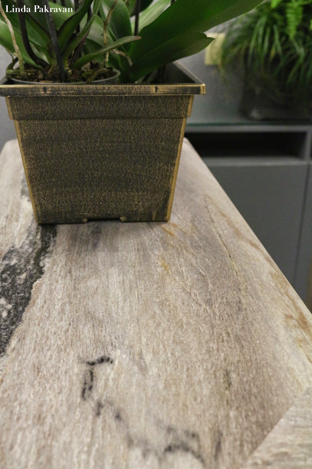
I used the 180fx La Dolce Vita pattern for a medical practice Check-In and the staff kitchen. JCW Countertops did the expert fabrication and install.
 |
| The old sliding glass windows BEFORE. |
The glass was nothing but a problem. It was unfriendly; a physical barrier between staff and clients. It enclosed the work space compromising the old, old HVAC system. It was either unbearably hot or ridiculously cold. And that blasted track! Smack in the middle making it difficult to fill out forms. All gone.
 |
| I increased the width and added a little 'swell' where the countertop met the wall. |
Under the check-in counter, I installed MDC's Impact Walls. Thermoplastic sheets with high impact resistance that look good. You've probably seen other patterns in elevator cabs. I chose the hammered metal pattern in Silver for this project. Impact Walls can take real abuse (hence the name), like sustaining a bash by a stroller. Hides fingerprints too.
For a cohesive look, it was also installed on the wall behind the check-in.
In consideration of the project's conservative financial target, I did not recommend the purchase of a new credenza. Instead, I took down this old wall mounted cabinet,
flipped it upside down, had a simple base built, a paint job, new hardware, and had a glass top made to protect it. Voilà! A credenza from an old, hulking wall hanging cabinet.
Formica's 180fx are true-to-scale granite patterns on 4'x8' sheets of laminate.
This is a genius idea, there are no pattern repeats which are a dead give away with laminate.
The down side is the edge detail is a dead give away that it is not real stone.
But that's OK. Not every kitchen and bath needs to be clad in marble or granite.
When real stone is impractical or exceeds the project's financial parameters, Formica's 180fx stone look patterns are an excellent option.
While I may not put it in my personal kitchen, I would put this in my lake or beach house (if I had one) or my ski condo (if I had one) or my rental property (if I had one).
All in all, Formica 180fx is a great value for the right application.
 |
| A sleek new clock and real orchids add interest and a touch of nature. |
This post was NOT sponsored or solicited by Formica, JCW Countertops or MDC.
Thanks for reading,
Linda Pakravan


No comments:
Post a Comment
Please do. I love to know what you think!